How to Choose Engraving Font Style for Gifts
The right engraving font style for gifts is defined by three factors: legibility at small sizes, compatibility with the engraving material, and emotional fit with the occasion. Font choice is not a cosmetic decision. It determines whether a name on a wedding keepsake reads clearly in 20 years or fades into an unreadable blur after the first polish. Personalized gifts like jewelry, plaques, and wooden keepsakes each carry different technical demands. Sources including Custom Ink and Thunder Laser USA confirm that font structure directly affects engraving quality, not just appearance.
✦ Featured From Our Shop ✦
Handcrafted & laser engraved in Georgia, just for you
How to choose engraving font style gifts: the core framework
Font selection for engraved gifts falls into four main categories: sans serif, serif, script, and decorative. Each serves a different purpose, and knowing which to use prevents costly mistakes.
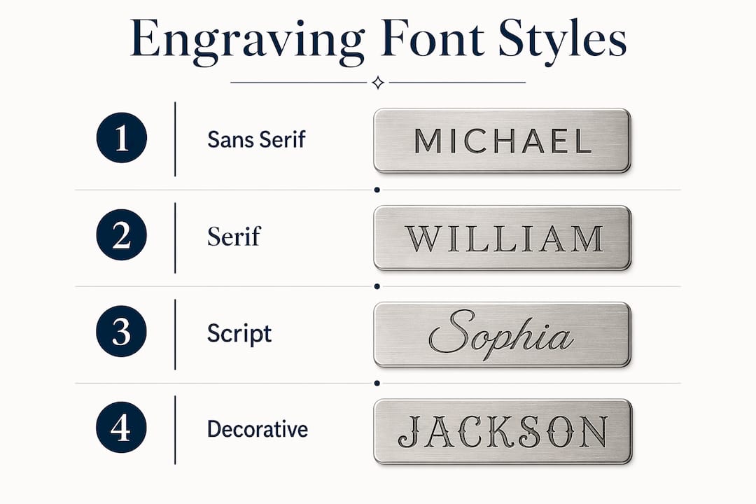
Sans serif fonts like Arial and Helvetica are the workhorses of gift engraving. Sans serif fonts provide superior readability and consistent results across metal, wood, glass, and acrylic. They work especially well on corporate gifts, everyday accessories, and any item where the text is small. Their clean, open strokes hold up under the laser without filling in or breaking apart.
Serif fonts deliver a classic, premium feel. Think Times New Roman or Garamond on a formal award plaque or a leather-bound journal. The catch is that thin serifs can break down at small sizes. Always choose a medium or bold weight when using serif fonts on engraved gifts, and avoid anything with hairline strokes.
Script fonts carry the most emotional weight. They feel personal, romantic, and celebratory. Script fonts work best for personalized gifts when engraved at larger sizes with bold strokes and open loops. A thin, looping script on a tiny pendant will lose its loops entirely under the laser. On a larger piece like a cutting board or a framed print, the same font looks stunning.
Decorative and single-line fonts are niche choices. Single-line fonts are purpose-built for engraving machines because the laser traces one continuous path instead of filling in a shape. They engrave faster and work well on items where speed and efficiency matter. Decorative fonts with complex shapes are best reserved for large-format pieces where detail can survive the process.
Pro Tip: Match the font category to the gift size first, then consider the occasion. A script font on a small ring is a technical risk. The same script on a large wooden sign is a beautiful choice.
How do size and material affect your font choice?
Font size and material surface are the two most overlooked factors when selecting engraving styles for gifts. Getting both wrong produces a gift that looks blurry or unfinished.
Metal and wood accept the finest detail. The recommended minimum font size on metal and wood is approximately 8 pt. Below that threshold, even well-designed fonts start to lose definition.
Slate and glass have rougher or more reflective surfaces. These materials require a minimum of 10 pt for reliable legibility. The texture of slate scatters the laser beam slightly, which softens fine details. Glass engraving creates a frosted effect that can blur hairline strokes.
Hairline serifs and script fonts need even more room. Custom Ink recommends 12 pt or larger for any font with thin strokes or tight loops. This is not a suggestion. It is the threshold below which the font simply will not read correctly.
Text smaller than 0.25 inches requires a font switch. Switching to simpler font styles below this size improves legibility significantly. A sans serif font at 0.2 inches reads clearly. A decorative script at the same size becomes a smear.
Surface texture changes everything. The same font can engrave perfectly on metal but lose detail on rough or absorbent materials like leather or stone. Laser physics and material interaction are inseparable from font selection.
Pro Tip: Always request a test engraving on a scrap piece of the same material batch before committing to the final gift. Surface variation within the same material type is real, and a test costs far less than a ruined keepsake.
What are the best practices for preparing font files for engraving?
File preparation is where many personalized gift orders go wrong. The font you see on screen is not always the font the laser machine receives.
The single most important step is converting your font to vector outlines before sending the file to an engraver. Engraving professionals recommend converting fonts to outlines early in the design workflow. This prevents font substitution, spacing shifts, and character rendering errors that degrade the final gift quality. Once a font is outlined, it becomes a fixed shape rather than a text object that depends on software interpretation.
Vector formats like SVG and EPS are the correct file types for engraved gifts. Vector artwork prevents quality loss and ensures crisp text edges compared to raster images like JPG or PNG. Raster images are made of pixels. When the laser software scales them up or interprets them at high resolution, the edges become jagged. Vector paths scale without any loss.
A few additional file preparation rules that protect your gift quality:
- Use closed paths on all letterforms. Open paths cause the laser to trace incomplete shapes.
- Set stroke width to match the minimum line width your material can hold. For metal, this is typically 0.3 mm or thicker.
- Remove overlapping paths between letters. Overlaps cause the laser to double-burn those areas, creating dark spots.
- Check letter spacing manually after outlining. Software sometimes shifts kerning when converting text to outlines.
The font style can dramatically affect production efficiency and final engraving sharpness, especially when comparing CNC engraving to laser engraving. Knowing your production method before finalizing the font saves time and money.
How to match font style to gift type and occasion
The occasion shapes the font as much as the material does. A font that feels perfect for a retirement plaque would feel cold on a wedding gift. Matching the emotional tone of the font to the moment is what separates a memorable gift from a generic one.
Weddings, anniversaries, and romantic gifts call for script fonts. Fonts like Edwardian Script or Lavanderia carry warmth and intimacy. They signal that the giver took time to choose something personal. Keep the text large enough to preserve the loops, and pair the script with a simple sans serif for any secondary text like a date or location.
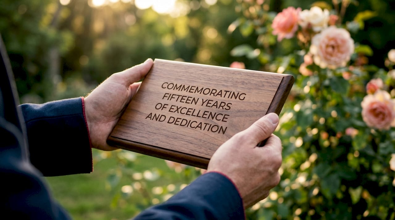
Plaques, awards, and formal keepsakes suit serif fonts. A bold serif like Trajan or Palatino communicates authority and permanence. These fonts have been used on monuments and official documents for centuries. That history carries meaning on a retirement award or a memorial plaque.
Corporate gifts and everyday personalized accessories work best with sans serif fonts. Clean, modern fonts like Futura or Gill Sans read well at small sizes and feel professional without being cold. They also engrave consistently across the widest range of materials, which matters when ordering gifts in bulk.
Milestone gifts for children like first-birthday keepsakes or graduation frames can handle a touch of personality. A rounded sans serif like Nunito or a simple block font adds warmth without sacrificing legibility. Avoid novelty fonts with extreme decorative elements on small items.
Balancing readability and emotional tone is the real skill in selecting engraving styles for gifts. The font carries part of the message. Choose it with the same care you give to the words themselves.
Key Takeaways
The best engraving font for a gift is the one that reads clearly on the chosen material, fits the occasion’s emotional tone, and survives the technical demands of the laser or CNC process.
| Point | Details |
|---|---|
| Font category matters first | Sans serif fonts offer the widest compatibility; script fonts suit large, personal pieces. |
| Size drives legibility | Use at least 8 pt on metal and wood, 10 pt on slate and glass, 12 pt for hairline styles. |
| Material changes the result | The same font engraves differently on metal versus leather or stone. Always test first. |
| Vector files protect quality | Convert fonts to outlines in SVG or EPS format before sending files to any engraver. |
| Occasion guides font mood | Script for romance, serif for formality, sans serif for corporate and everyday gifts. |
What I’ve learned from years of watching font choices make or break a gift
Most gift shoppers focus on the message and forget the font entirely. They type a name, pick the first script they see, and assume the engraver will handle the rest. That approach produces disappointing results more often than people realize.
The most common mistake I see is choosing a thin, flowing script for a small piece of jewelry. It looks beautiful on screen. On a silver pendant smaller than a quarter, the loops fill in and the name becomes illegible. The gift still ships. The recipient still smiles. But the engraving does not hold up, and that matters for a gift meant to last decades.
My personal preference for most gift engraving is a clean, medium-weight sans serif for any text under half an inch, paired with a bold script for a single name or initial at a larger size. That combination gives you legibility where it counts and personality where there is room for it.
Physical testing of font size and spacing is more reliable than software metrics. Engraving software interprets font height differently than design software does. What reads as 10 pt in Adobe Illustrator may engrave at a noticeably smaller size. Always proof on the actual material.
The broader lesson is this: think of the font as part of the gift design, not an afterthought. The right font on the right material, sized correctly for the space, turns a simple engraved item into something genuinely worth keeping.
— Gary
Signaturelaserdesigns makes font selection part of the craft
At Signaturelaserdesigns, we treat font selection as a core part of every custom order, not a checkbox at the end of the process. Our team works with you to match the right font to your material, your occasion, and your message before a single pass of the laser.
We engrave on metal, wood, glass, slate, and leather, and we know exactly how each surface responds to different font weights and styles. Whether you are ordering a single engraved keepsake or a set of personalized corporate gifts, we proof every design before production. You see what the font looks like on your chosen material. No surprises, no disappointments. Browse our personalized engraved gifts to find the perfect starting point for your next thoughtful gift.
FAQ
What is the best font for engraving small text on gifts?
Sans serif fonts like Arial are the best choice for small engraved text because their open strokes and simple shapes hold up at sizes as small as 8 pt on metal and wood. Avoid hairline serifs or script fonts below 0.25 inches.
Why do script fonts sometimes look blurry when engraved?
Script fonts lose detail when engraved at small sizes because their thin loops and hairline strokes break down under the laser. Engraving script fonts at larger sizes with bold strokes prevents this problem.
What file format should I send to an engraver for the best results?
Send your design as an SVG or EPS file with all fonts converted to vector outlines. Vector formats ensure crisp edges and prevent quality loss that raster images like JPG or PNG cannot avoid.
Does the material change which font I should use?
Yes. Font choices must account for how the laser interacts with each surface. Metal holds fine detail well, while leather and stone require simpler, bolder fonts to maintain legibility after engraving.
How small can engraved text realistically go?
Simple sans serif fonts can remain readable at 5–6 pt depending on laser precision and material quality, but 8 pt is the practical minimum for reliable results on most gift materials.
Recommended
- Engraved Gift Occasions Guide: Every Milestone Covered
- What Messages Work on Engraved Keepsakes: 2026 Guide
- Craft Engraving Design Inspiration Ideas for DIYers
- Why Gift Givers Choose Engraved over Printed Gifts