1–3 Inch Engraving Window: Fonts That Work on Wedding Pie Servers
The best rule for how to choose a font for an engraved wedding pie server is to stick with two fonts total: a decorative or script style for the names, kept to one short line, and a clean sans-serif or sturdy serif for the date and other details. Look for open counters (the little enclosed spaces inside letters like “e” and “a”) and medium stroke weight over anything thin or flourished. That combination reads clearly at small sizes and looks intentional rather than cluttered. Keep in mind that your material and the size of the engraving area can shift these recommendations, so a quick test is always worth the extra day.
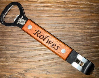
✦ Featured From Our Etsy Shop ✦
Handcrafted & Laser Engraved Just For You
TL;DR:
- Avoid ultra-thin serif and script fonts with tight counters, as they tend to blur or fill in during engraving on small surfaces.
- Use a maximum of two fonts, pairing a decorative script for names with a simple sans-serif for dates, to maintain clarity and elegance.
- Prioritize font testing on the actual material and size before finalizing, since digital previews often do not reflect engraved results accurately.
- Keep text to one or two lines, with a font size no smaller than eight points for metal or smooth wood, and consider monograms for limited space.
- Match font style to the wedding aesthetic, ensuring that the engraving style complements the overall design to enhance harmony across the event details.
Table of Contents
- Which Font Families Work Best for Engraved Pie Servers?
- How Much Text Fits on a Pie Server, and What Size Should It Be?
- Does the Material Change Which Font You Should Pick?
- How Do You Pair Fonts for a Wedding Pie Server?
- How Do You Prepare and Test an Engraving File Before Production?
- What a Working Engraver Sees Every Day
- What Mistakes Should You Avoid When Choosing an Engraving Font?
- How Should Your Font Match Your Wedding Invitations and Decor?
- What Actually Matters When You’re Choosing This Font
- How Signature Laser Designs Can Help You Get This Right
- A Few More Places to Look
- Sources
- FAQ
Which Font Families Work Best for Engraved Pie Servers?
Sans-serif fonts are the safest starting point for any small engraved surface. Their uniform stroke widths and stable, open counters hold up when the letters shrink down to fit a two-inch handle, and they rarely blur or fill in during the engraving process.
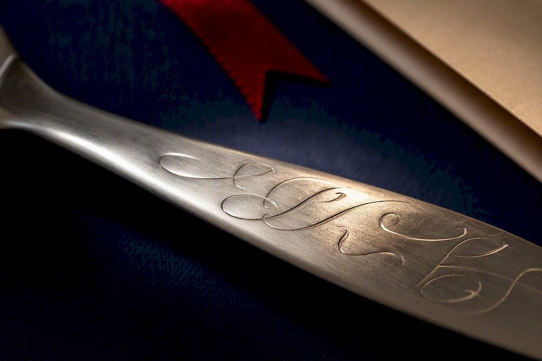
Serif fonts can work beautifully too, but only at slightly larger sizes and only when you pick a medium or bold weight. Thin hairline serifs are the number one thing to avoid. Professional engravers advise prioritizing balanced stroke weights and skipping excessive flourishes because engraving behaves nothing like ink on paper; a stroke that reads fine in a digital proof can vanish entirely once it hits metal.
Script and decorative fonts earn their place for names or monograms, provided the letters have open counters and restrained flourishes. Script fonts are suitable for names on wedding pieces but require open counters and thicker strokes to survive the transfer from screen to blade.
Steer clear of these choices on a pie server:
- Hairline or ultra-thin serif fonts, which tend to disappear at engraving scale
- Scripts with tight, closed counters that fill in and blur letters together
- Heavy swashes and connecting flourishes that look elegant on paper but muddy up in metal or wood
- Ultra-condensed display fonts, which squeeze letterforms too close for clean separation
How Much Text Fits on a Pie Server, and What Size Should It Be?
A typical pie server handle gives you an engraving window of roughly one to three inches, depending on the style. That space limits you to a first name, a monogram, or a short phrase on a single line, with room for a second line if you want to stack a name above a wedding date.
- Keep names to a single line whenever possible. Two names plus a date usually calls for a two-line layout, with names on top and the date smaller underneath.
- Size your font no smaller than 8 points as a baseline for metal or smooth wood. Scripts and more detailed materials like glass or slate often need 10 to 12 points to hold their shape reliably.
- Choose sentence case over all caps for names and dates. All caps can look formal, but it also removes the ascenders and descenders that make letters easy to tell apart at a glance, so sentence case usually reads warmer and clearer at small sizes.
- Consider a monogram instead of full names if your chosen font can’t shrink below its readable minimum. Initials in a bolder script often look more elegant than a full name squeezed too tight to read.
If you’re still deciding what to actually say on the server, wedding pie server engraving ideas can help you settle on wording before you settle on a font.
Does the Material Change Which Font You Should Pick?
Yes, and this is the step most couples skip. Polished stainless steel holds fine detail well, which means a delicate script can survive there that would blur badly on raw or unfinished wood. Brushed metal sits in the middle: it hides razor-thin strokes a little better than a mirror finish but still rewards medium weight over anything too fine.
Wood is the trickiest substrate because grain and porosity vary piece to piece. Engraving rules of thumb call for solid, continuous strokes over hairlines and matching the font to the substrate, since polished metal simply holds finer detail than wood does.
Method matters as much as material:
- Laser engraving on polished metal can render tighter counters and thinner strokes than most wood grains will tolerate.
- Hand engraving tends to favor slightly bolder letterforms since fine detail is harder to control by hand than by laser.
- On porous or textured wood, increase both stroke weight and letter spacing (tracking) to keep the design from looking cramped once the grain interrupts a line.
- Always request a scrap test on your actual material before committing to full production. A comparison of etching, engraving, and marking methods explains why the same font can look completely different depending on the technique used.
How Do You Pair Fonts for a Wedding Pie Server?
The rule of thumb here is simple: pick one decorative font and one plain support font, and stop there. Limiting your selection to a maximum of two fonts, a script or decorative face for the names and a clear sans-serif for the date, keeps the design personal without sacrificing legibility.
Build hierarchy through size and weight rather than adding a third typeface. Names can run larger since they’re the emotional focal point, while the date sits smaller but still fully readable underneath.
- Give the script name font more visual weight; keep the date font lean and simple by comparison.
- Adjust letter spacing (tracking) so script letters don’t collide, especially where connecting strokes are involved.
- Avoid crowding: leave breathing room between the two lines of text so the eye can separate them instantly.
- Switch to a monogram or initials-only layout if a full first and last name won’t sit comfortably in your engraving area.
Pro Tip: Print your layout at actual size on regular paper first, tape it to the handle of a spare server or a similar-sized object, and see if you can read it from arm’s length. If you squint, so will your future dinner guests.
How Do You Prepare and Test an Engraving File Before Production?
A clean file prevents most of the problems couples run into after the fact. Following a short, ordered checklist catches issues while they’re still easy to fix.
- Set your text at final size inside your design file and export at 100% scale, never scaled up from a smaller draft.
- Convert all text to outlines before sending the file anywhere. This locks the letter shapes in place and prevents a missing font from silently substituting something else.
- Zoom in and check the counters. If letters look tight or the enclosed spaces seem like they’ll fill in, increase stroke weight or tracking before finalizing.
- Run a test panel on the actual material you’re using and ask for a photo proof before the full run goes into production.
Defining target size, converting text to outlines, checking kerning and tracking, and testing on the real material is standard practice among engravers, and it’s the single best way to avoid an unpleasant surprise on your wedding keepsake.
What a Working Engraver Sees Every Day
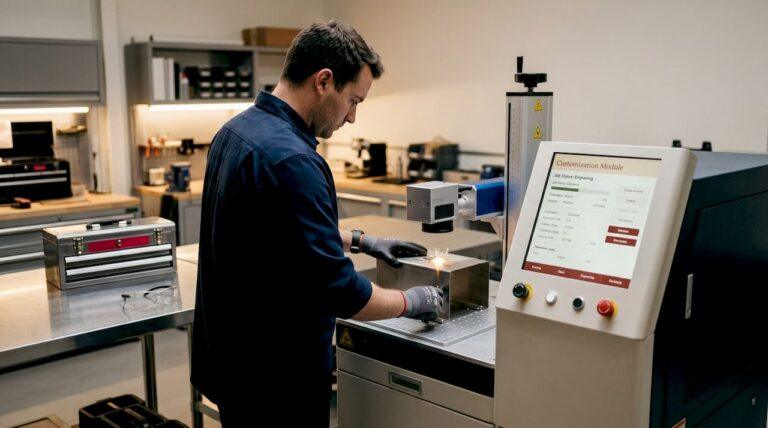
Gary has spent years running personalized keepsakes through the shop, and pie servers are some of the most requested wedding items on the list, alongside cake servers, flasks, and monogrammed jewelry. The shop handles both finished pieces ready to gift and unfinished wood blanks for couples who want to add their own touches.
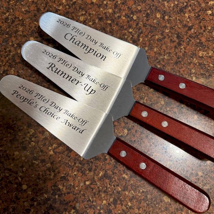
When a pie server order comes in, the first question is always the inscription length and the material, since those two factors decide which fonts are realistic before style ever enters the conversation. A short first name in a script pairs naturally with a printed date below it in a plain sans-serif, and that combination covers the majority of orders without complications.
Some couples return for anniversary gifts and shower presents after their wedding order turns out well, indicating customer satisfaction.
What Mistakes Should You Avoid When Choosing an Engraving Font?
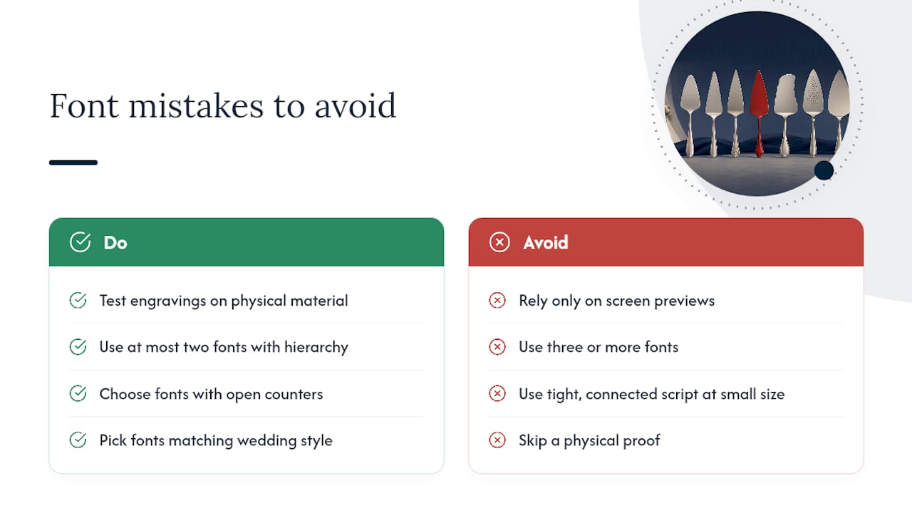
The most common mistake is picking a font because it looks good on a screen rather than testing how it behaves once it’s actually cut into metal or wood. A font that looks delicate in a digital preview can lose its fine strokes entirely once engraved, so a screen preview alone should never be your final decision point.
Another frequent error is using three or more fonts in one design. Every additional typeface adds visual noise, and a pie server’s engraving area is small enough that even two fonts need careful hierarchy to avoid clutter.
Couples also underestimate how much closed, tight counters hurt legibility at a small scale. A trendy script with connected loops might look romantic in a wedding invitation preview, but shrink it down to two inches and those tight spaces fill in, turning elegant letters into a blur.
Skipping a physical test is the mistake with the highest cost. A digital proof on a bright screen never tells the whole story, and by the time you notice a problem on the finished piece, it’s often too late to fix without a reorder. Finally, some couples pick a font that clashes with the overall feel of their wedding, choosing an ultra-modern sans-serif for a rustic barn wedding or an overly whimsical script for a formal black-tie affair. The font should feel like it belongs to the day, not like an afterthought bolted onto a gift.
How Should Your Font Match Your Wedding Invitations and Decor?
Your pie server doesn’t have to match your invitation suite letter for letter, but pulling from the same general style family creates a cohesive feel across your registry and keepsakes. If your invitations lean toward a modern minimalist look, an ornate script on your server will feel like it belongs to a different wedding entirely.
Start by identifying the general category your wedding falls into: classic and formal, romantic and soft, modern and clean, or rustic and relaxed. Wedding typography guidance suggests matching your font choice to your overall aesthetic and pairing a script with a sans-serif for contrast, which is the same pairing logic that works for stationery, table numbers, and engraved gifts alike.
You don’t need an exact font match between your invitations and your pie server. What matters more is matching the feeling: an airy, thin script on your save-the-dates suggests a delicate, romantic server font, while bold block lettering on your welcome sign points toward a cleaner, sturdier engraving choice. For more layout inspiration that carries this same coordinated approach across a full server set, personalized wedding cake server set ideas show how couples extend one font pairing across multiple pieces.
What Actually Matters When You’re Choosing This Font
Most engraving advice online treats font selection like a purely aesthetic decision, a matter of taste and Pinterest boards. That framing misses the point. A wedding pie server has maybe two square inches of usable space, and every stylistic preference has to survive contact with that constraint first.
The conventional wisdom oversells decorative fonts and undersells testing. Couples spend hours picking the “perfect” script and five minutes, if that, confirming it will actually engrave cleanly at the size their server allows. That’s backwards. The font family matters less than whether its counters stay open and its strokes hold weight at your specific size and material.
If you take one thing from this guide, prioritize the physical test over the digital preview. A font that looks romantic on your laptop screen is not the same object once a laser or a hand tool cuts it into stainless steel or maple. Ask for a proof. Look at it under real light, at real size, before you approve anything.
— Gary
How Signature Laser Designs Can Help You Get This Right
The engraving service can assist with font selection advice and provide proofs before full production to help ensure satisfaction.
The Custom Engraved Pie Server listing is a starting point if you’re ready to move forward, with turnaround times and proof options listed on the order page. There are also other personalized items available that can complement a gift set. Reach out with your details for assistance with font selection.
A Few More Places to Look
For deeper technical detail on file prep, the design-file prep guide from LaserEngravers walks through outlining and spacing step by step. For style inspiration tied to invitations and decor, The Knot’s wedding fonts roundup and the Canva wedding fonts guide both offer visual pairing examples worth browsing before you finalize your choice.
Sources
- Wedding fonts that’ll wow on your big-day invitations — The Knot
- Best fonts and text styles for laser engraving — Thunder Laser USA
- How to choose an engraving font for pewter gifts — CorelDRAW tips
- The 27 best fonts for laser engraving — Custom Ink Blog
- Text and typography for laser engraving — LaserEngravers design-file prep
FAQ
What Font Looks Best for Engraving?
Fonts with medium stroke weight and open counters look best for engraving, since thin hairlines and tight enclosed spaces tend to blur or fill in at small sizes. Clean sans-serif fonts are generally the safest choice for fine detail work.
What Are the Wedding Font Trends Heading Into 2026?
Couples continue to favor pairing one decorative script for names with a simple sans-serif for supporting details like dates, a combination that balances personality with legibility across invitations and keepsakes alike. Minimalist, modern sans-serifs are also gaining ground for couples with a cleaner overall wedding aesthetic.
What Is an Elegant Font for a Wedding?
An elegant wedding font is typically a script or refined serif with open counters and moderate flourishes, used sparingly for names or a monogram rather than for large blocks of text. Reserve the most decorative fonts for short lines, and let a plainer font carry dates or longer details.
What Are Some Good Script Fonts for Engraving?
Look for script fonts specifically designed with open counters and thicker connecting strokes, since standard script fonts made for print often have letterforms too delicate to survive engraving. A monogram or short first name in script, paired with a clear sans-serif for the date, is a reliable combination commonly recommended for wedding pie servers.
Recommended
- Wedding Pie Server Engraving Ideas Couples Will Love
- Personalized Wedding Cake Server Set Ideas for Couples
- How to Choose Engraving Font Style for Gifts